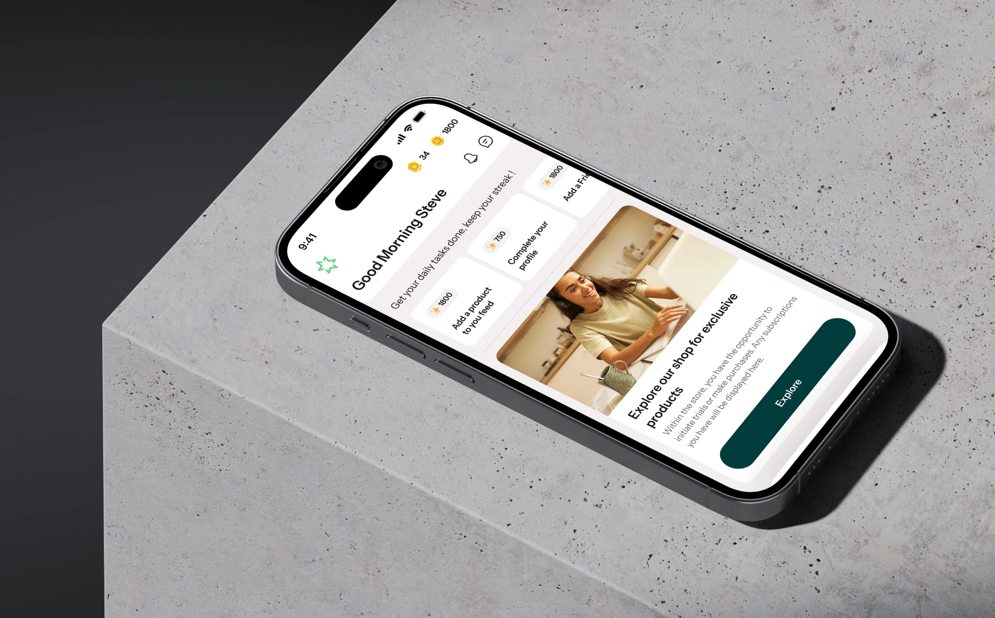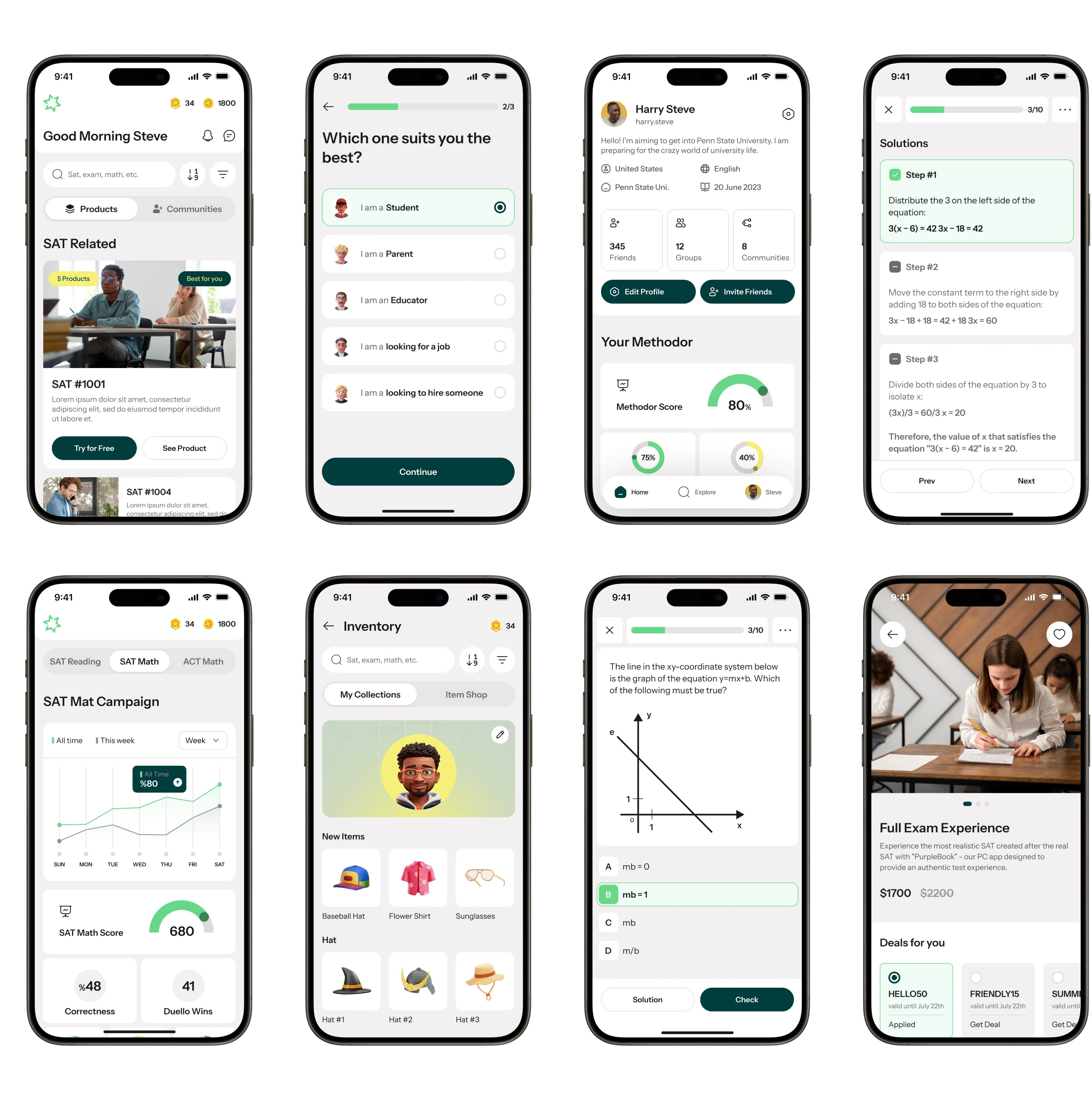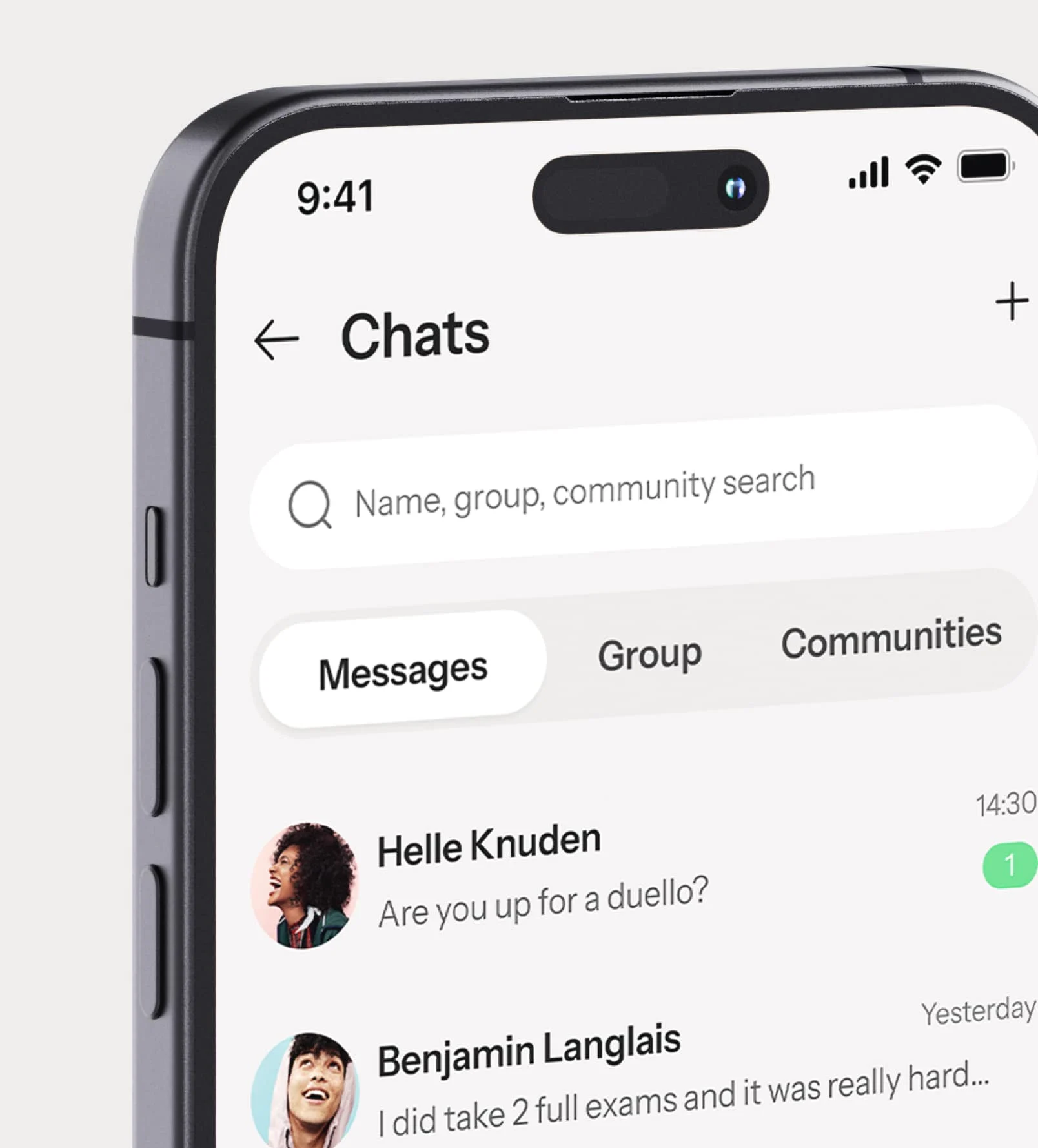
At DA-S, we collaborated closely with the project team to actualize their vision. Our involvement spanned from naming the project to developing its brand strategy, conceptualizing and crafting its visual identity, as well as designing their mobile application from inception to completion.
At Methodor, our journey begins with a commitment to weaving a compelling narrative that speaks directly to our audience, guiding and supporting them along their educational path.
Through a meticulous process of iteration and careful consideration, we proudly unveil the name "Methodor," chosen to embody our dedication to empowering learners. It stands as a symbol of strength and purpose, with our messages crafted to inspire and uplift, fostering a belief in individual capabilities.
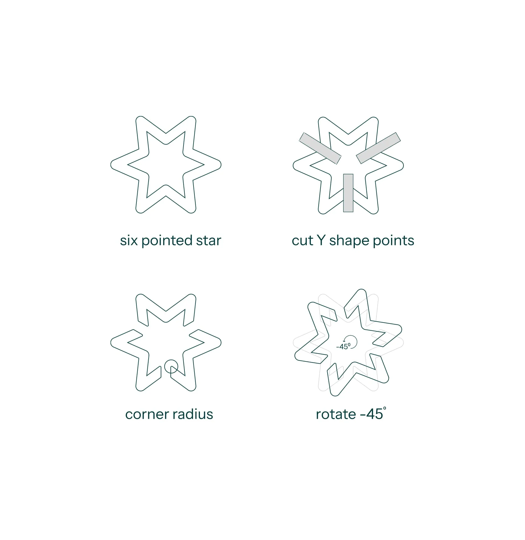

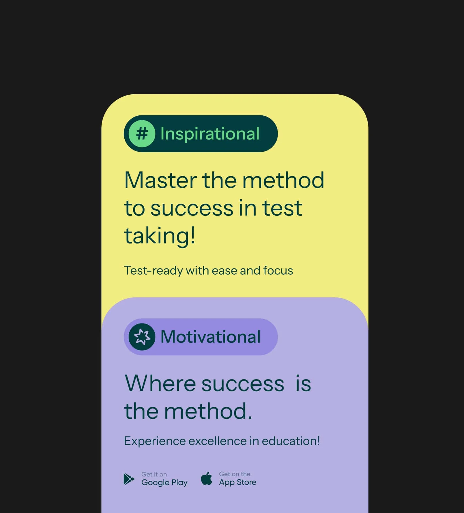

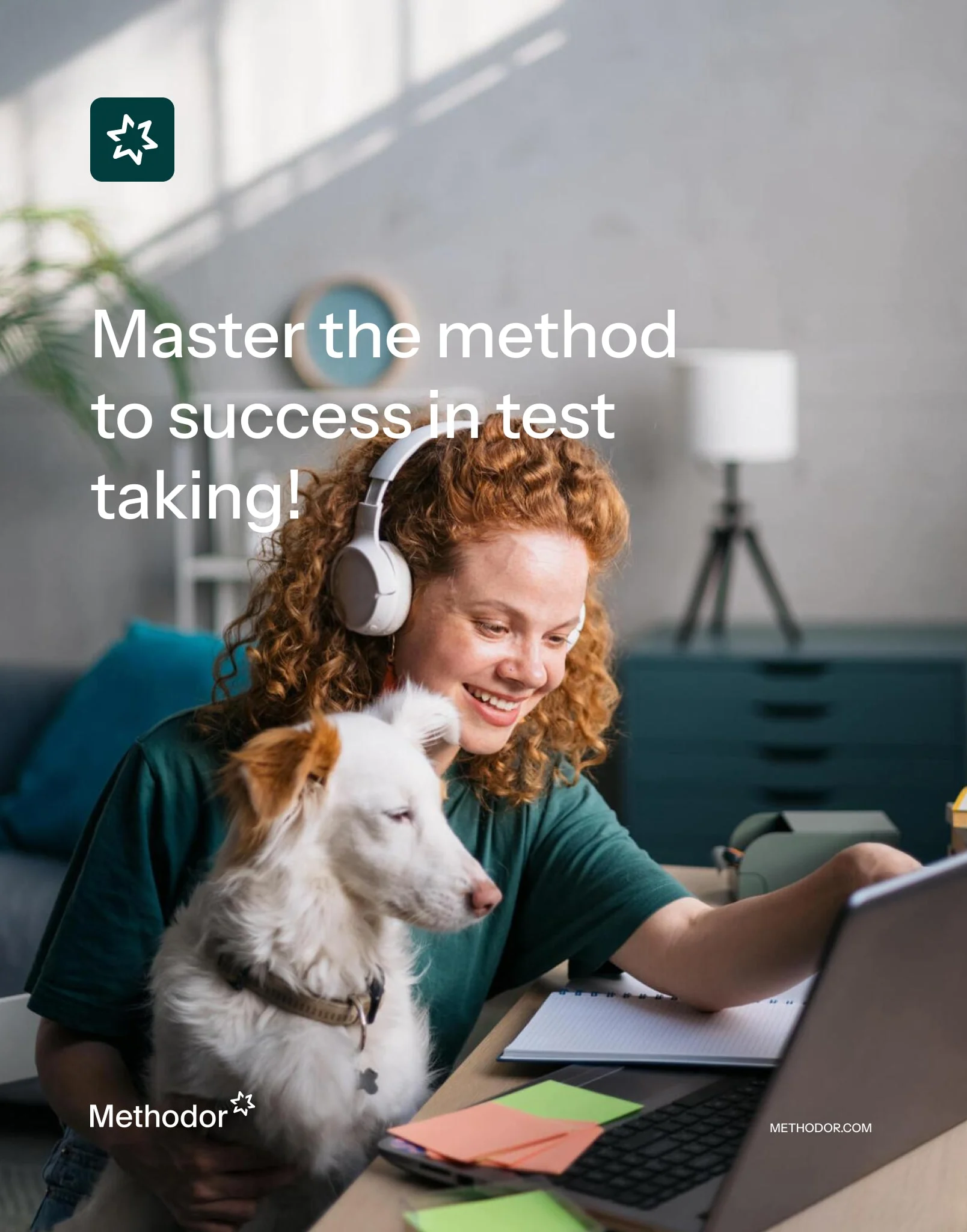
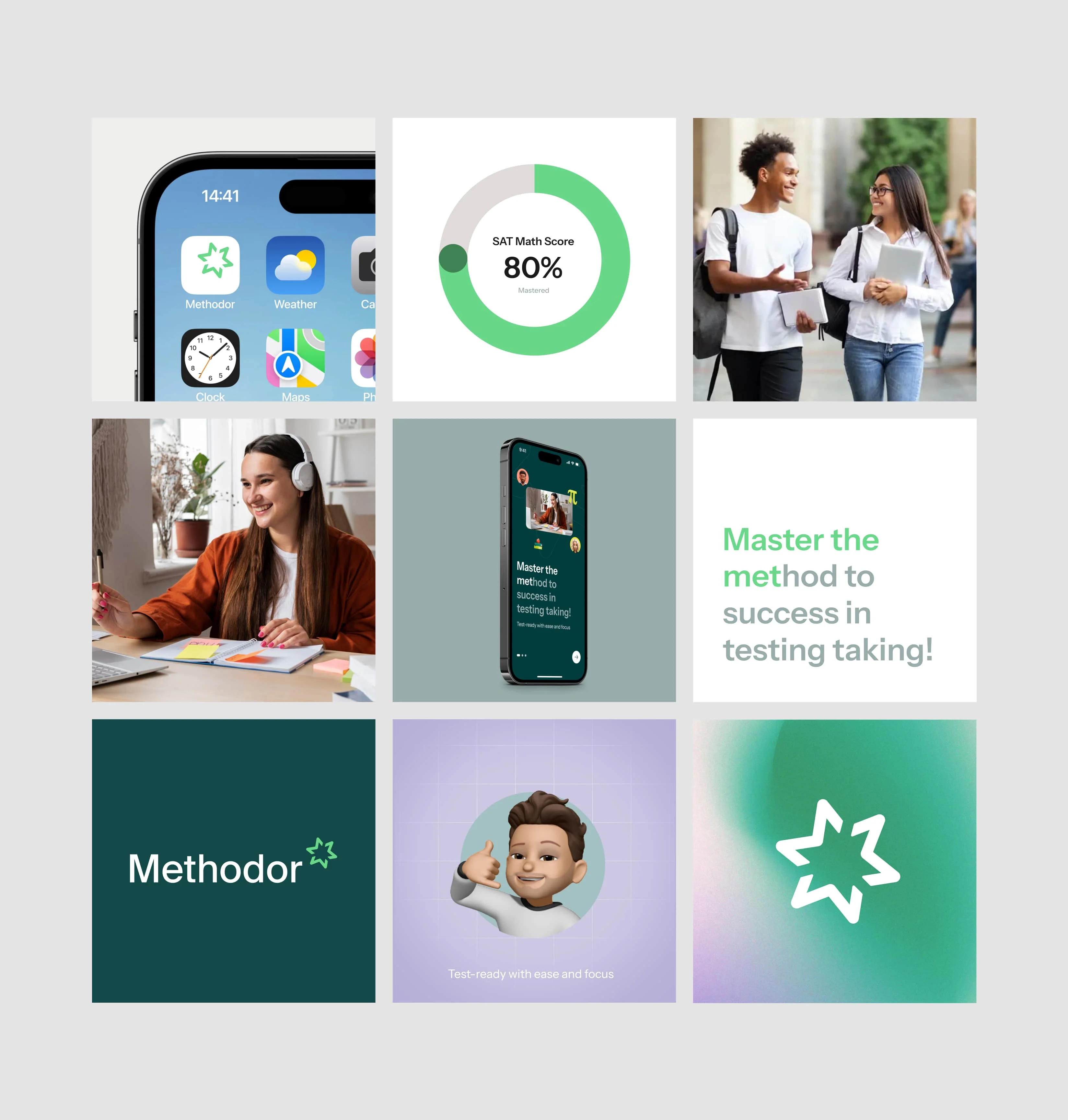
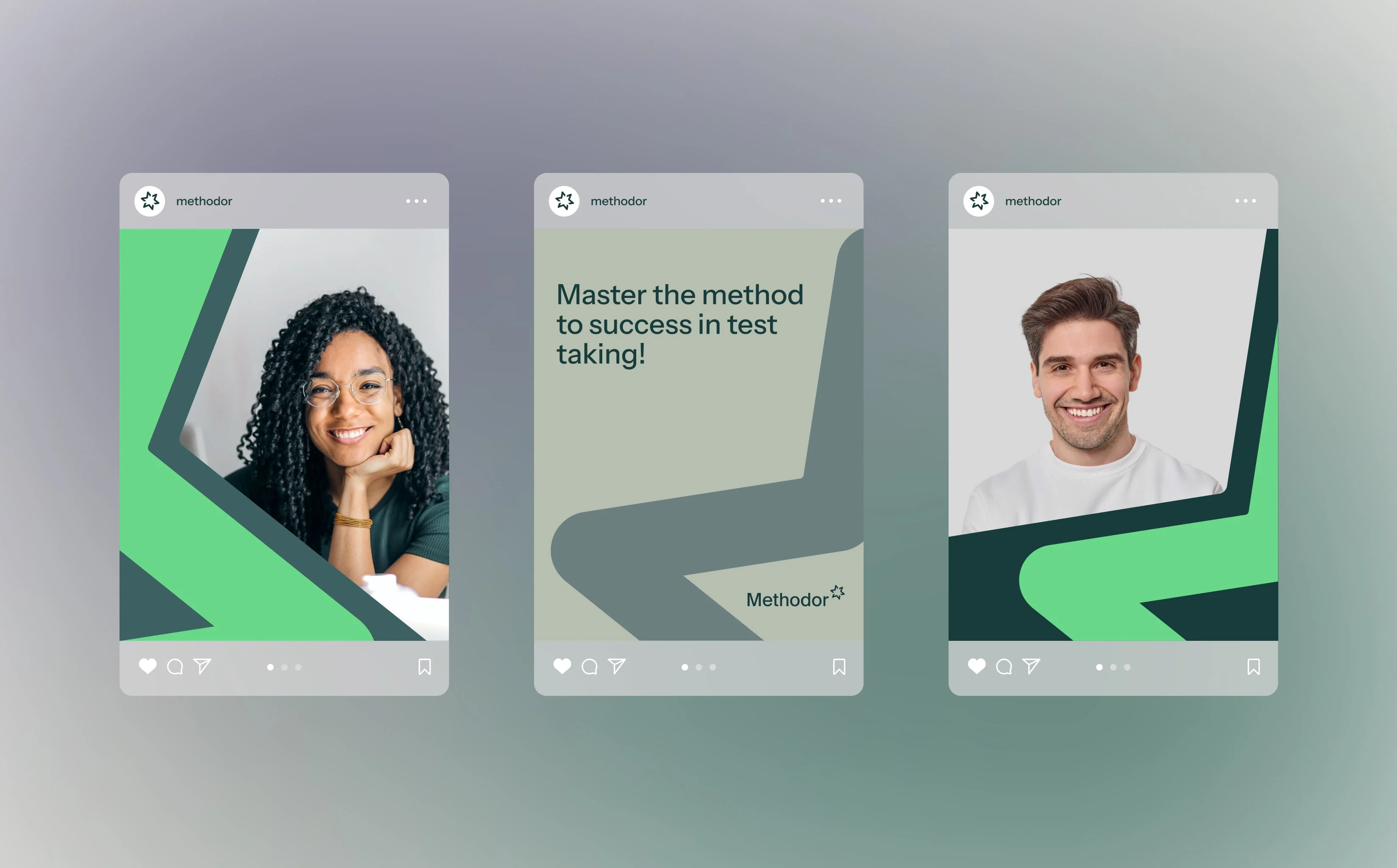
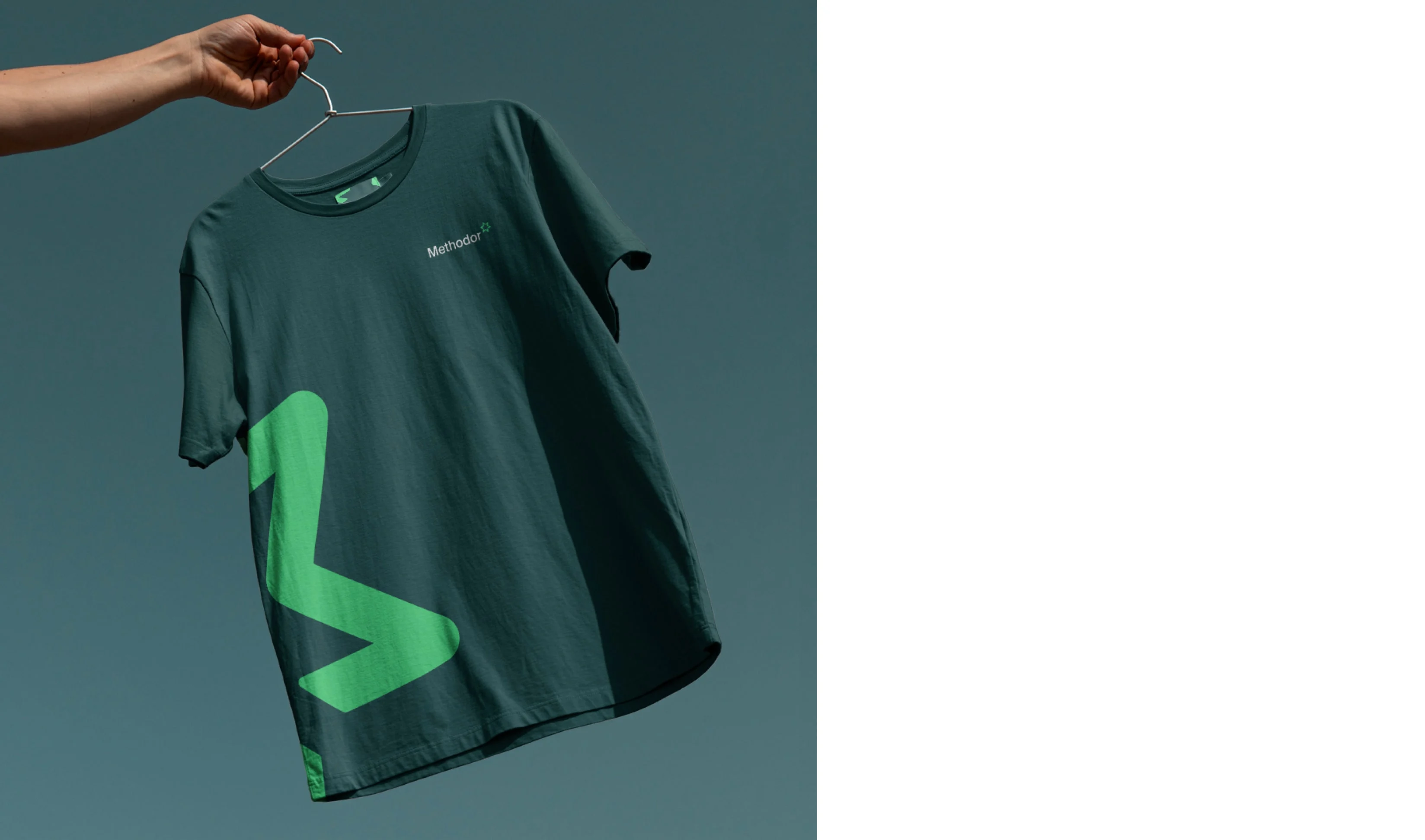
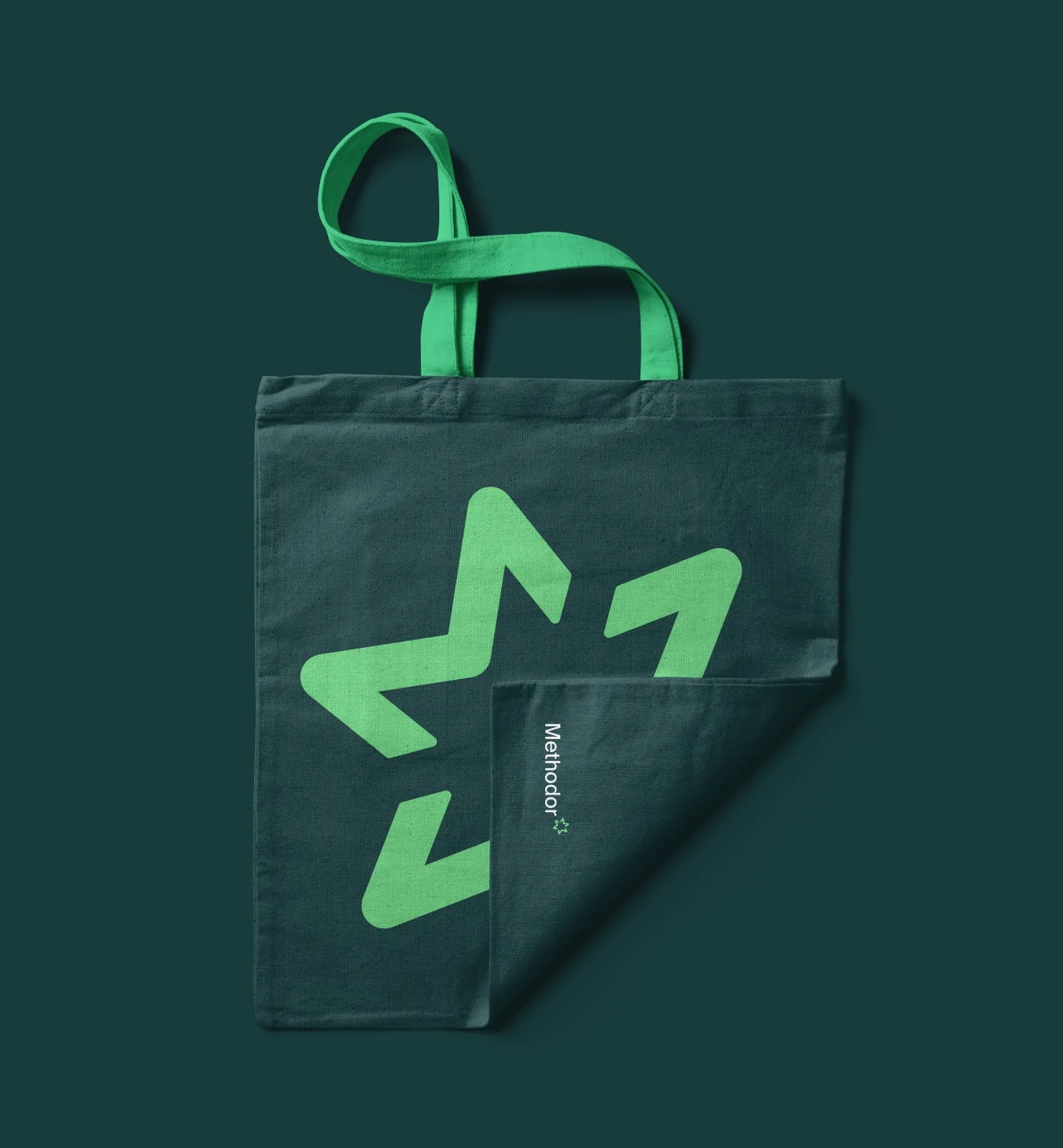
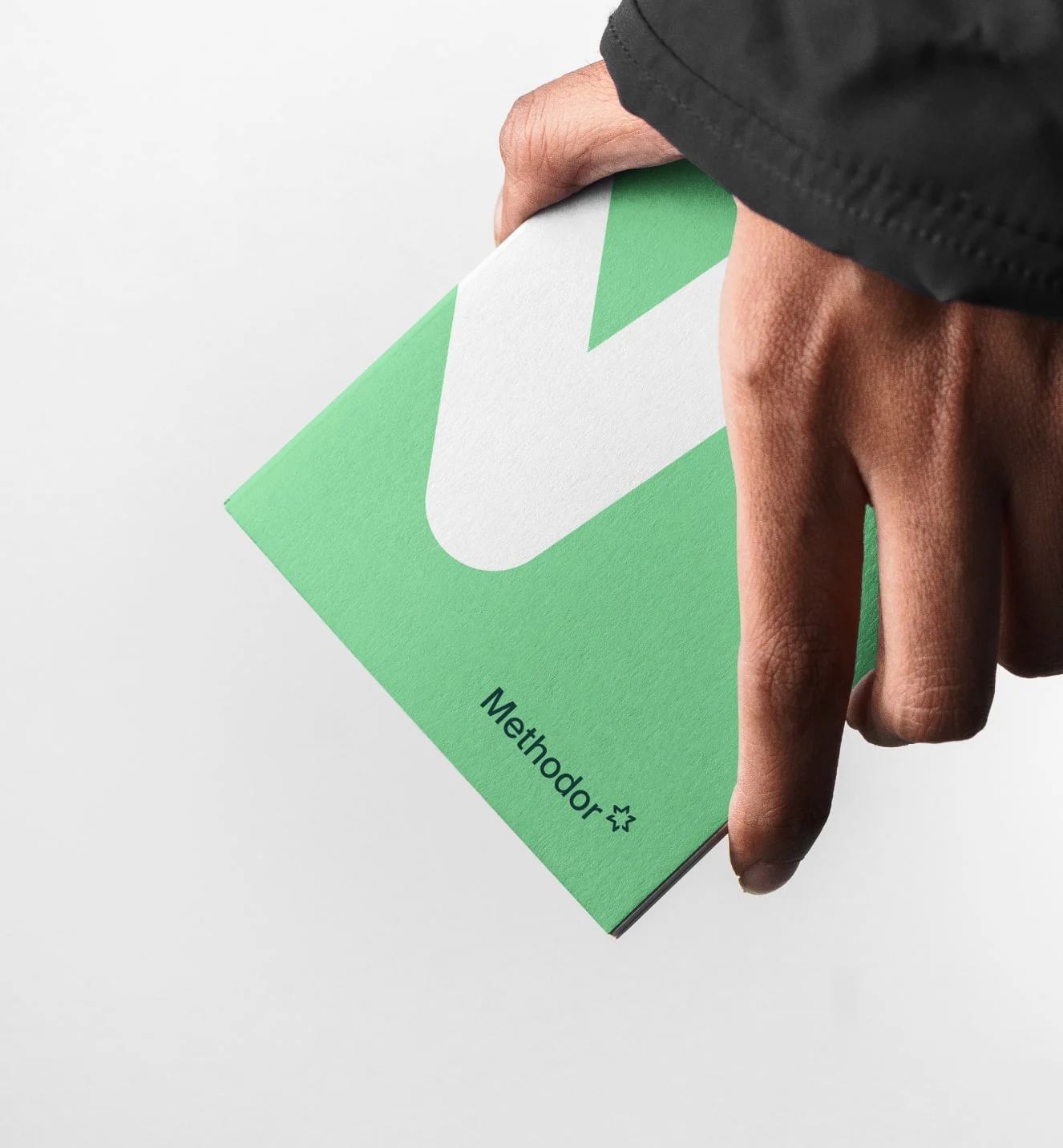
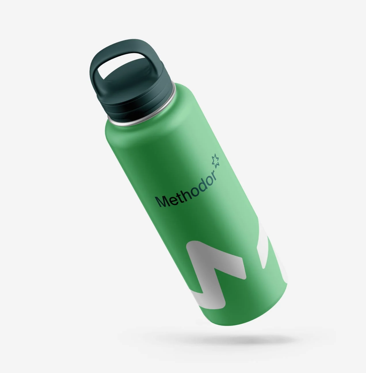
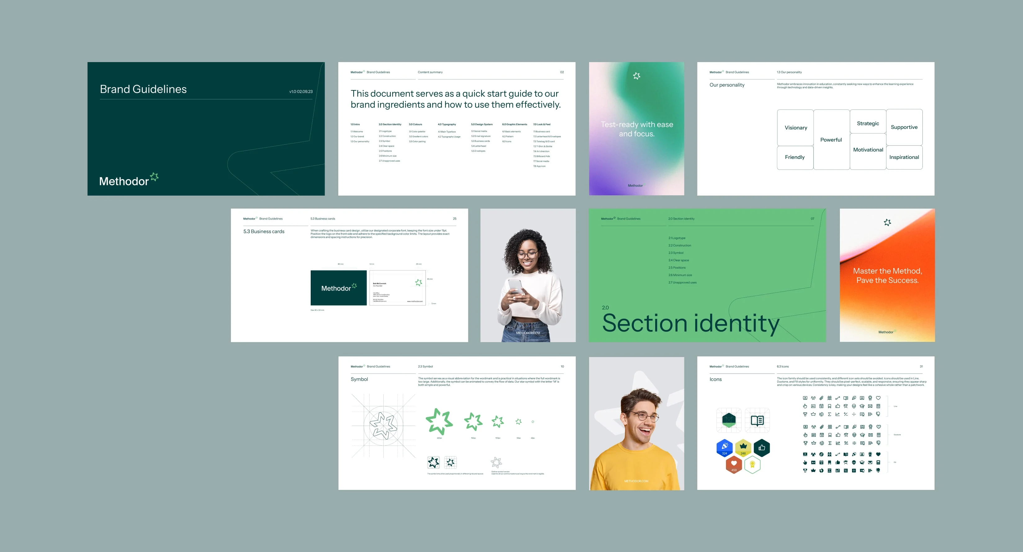
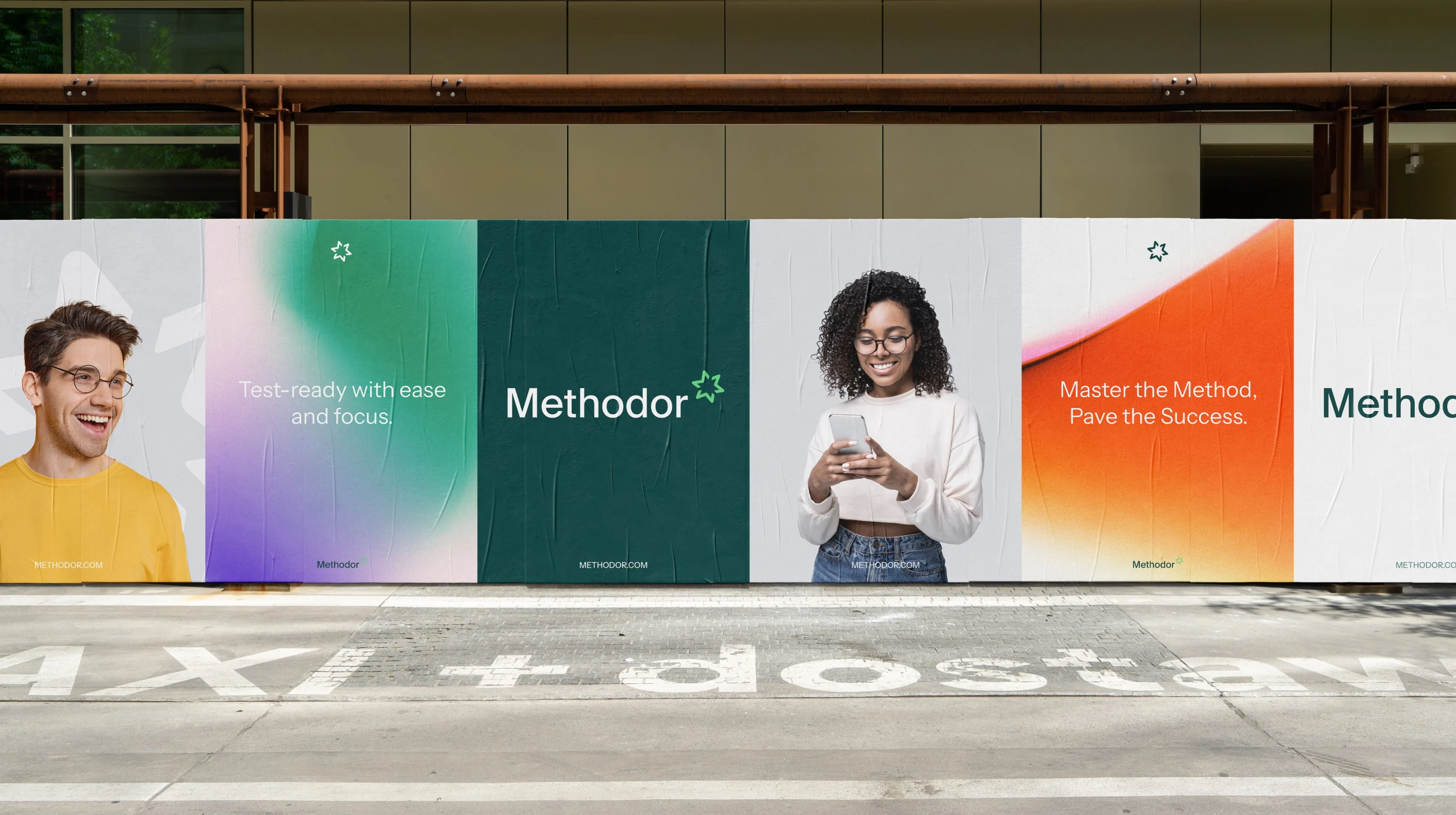
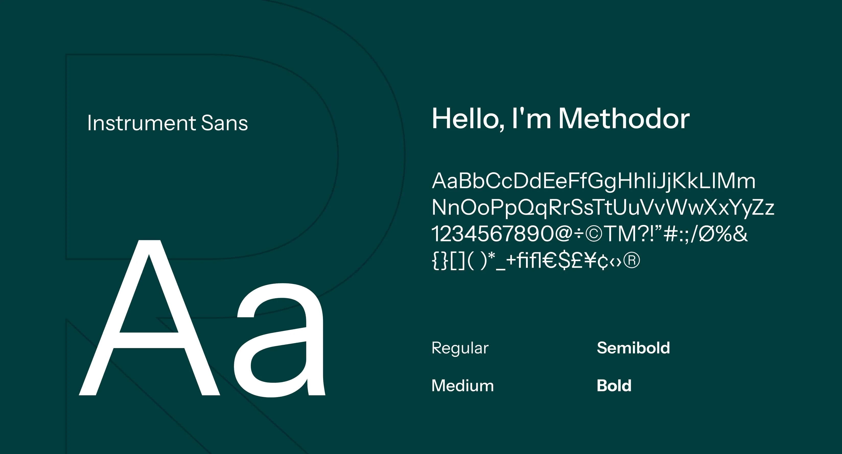
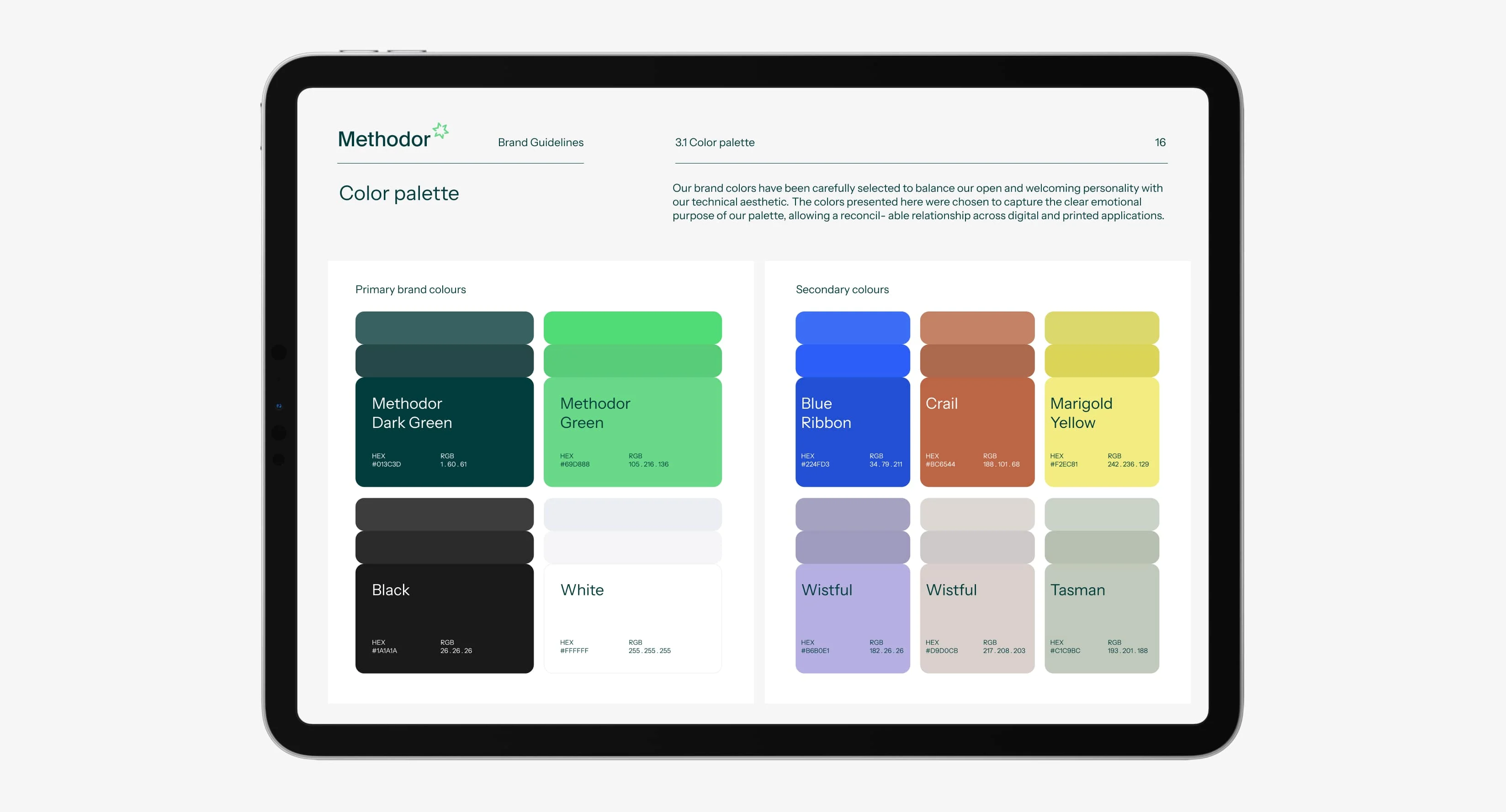
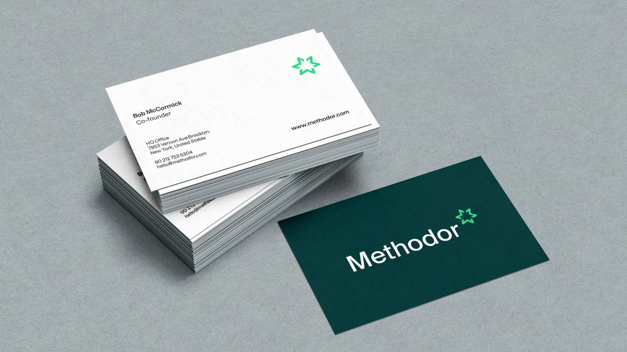
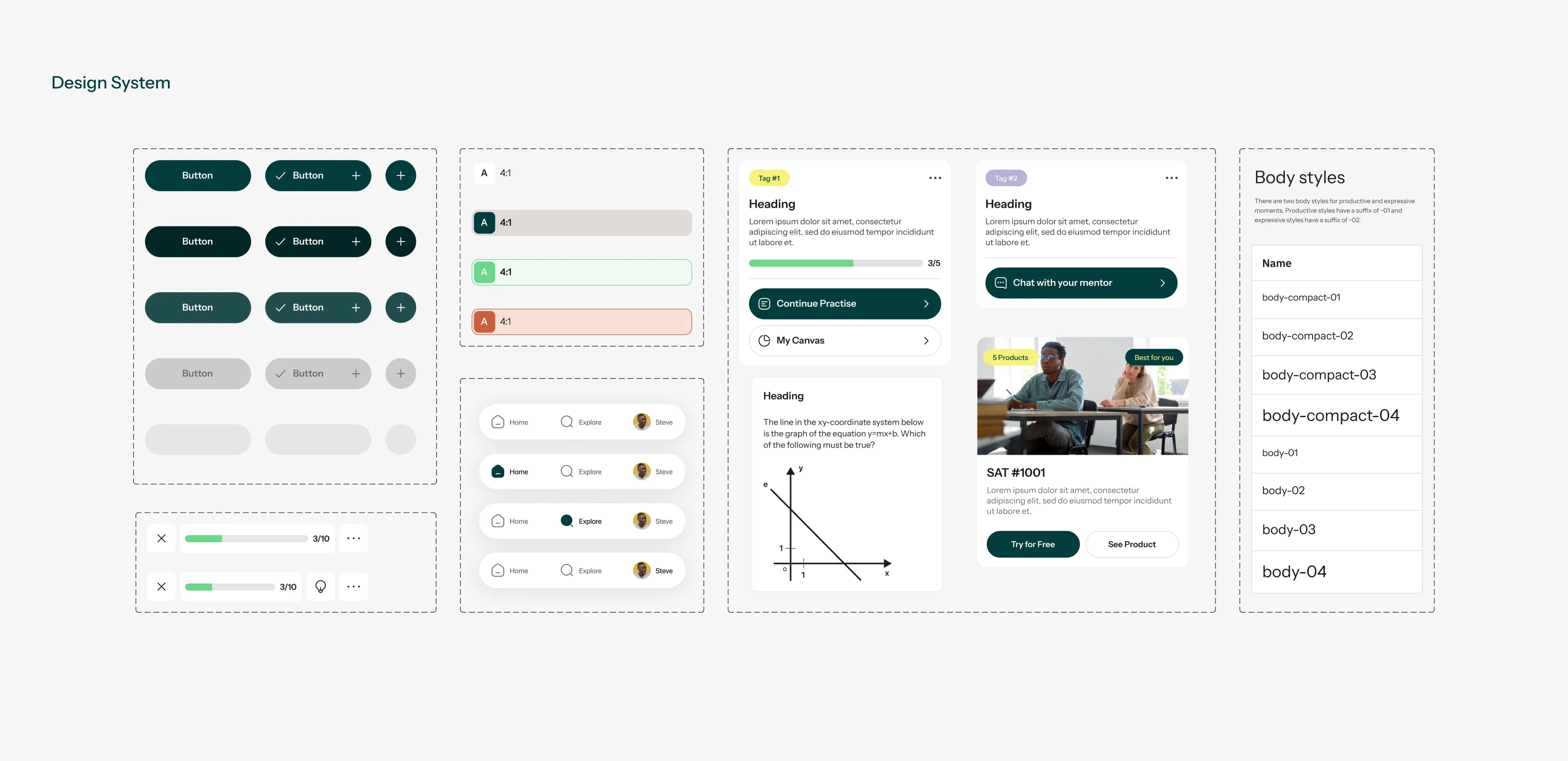
In developing Methodor's visual identity, we embarked on a journey with a profound grasp of the brand's core, striving to transform it into captivating visual elements. Our goal was to create an identity brimming with vibrant allure, harmonizing youthful dynamism with refined professionalism reflecting our commitment to educational expertise and excellence.Vibrant colors were chosen to radiate a friendly and inviting atmosphere, complemented by a strong shade of green and a modern, sleek typeface, evoking feelings of trust and growth.
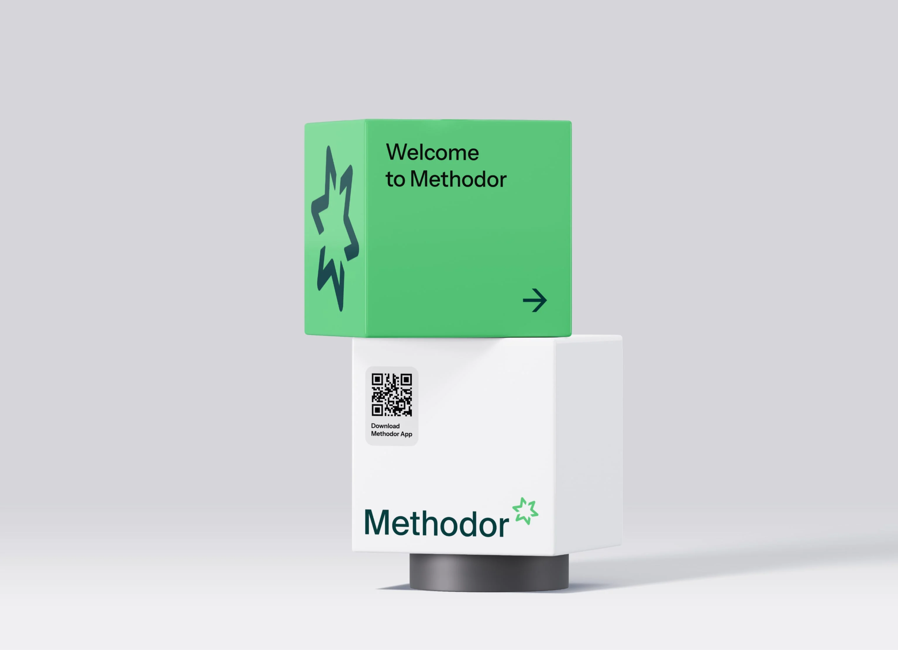
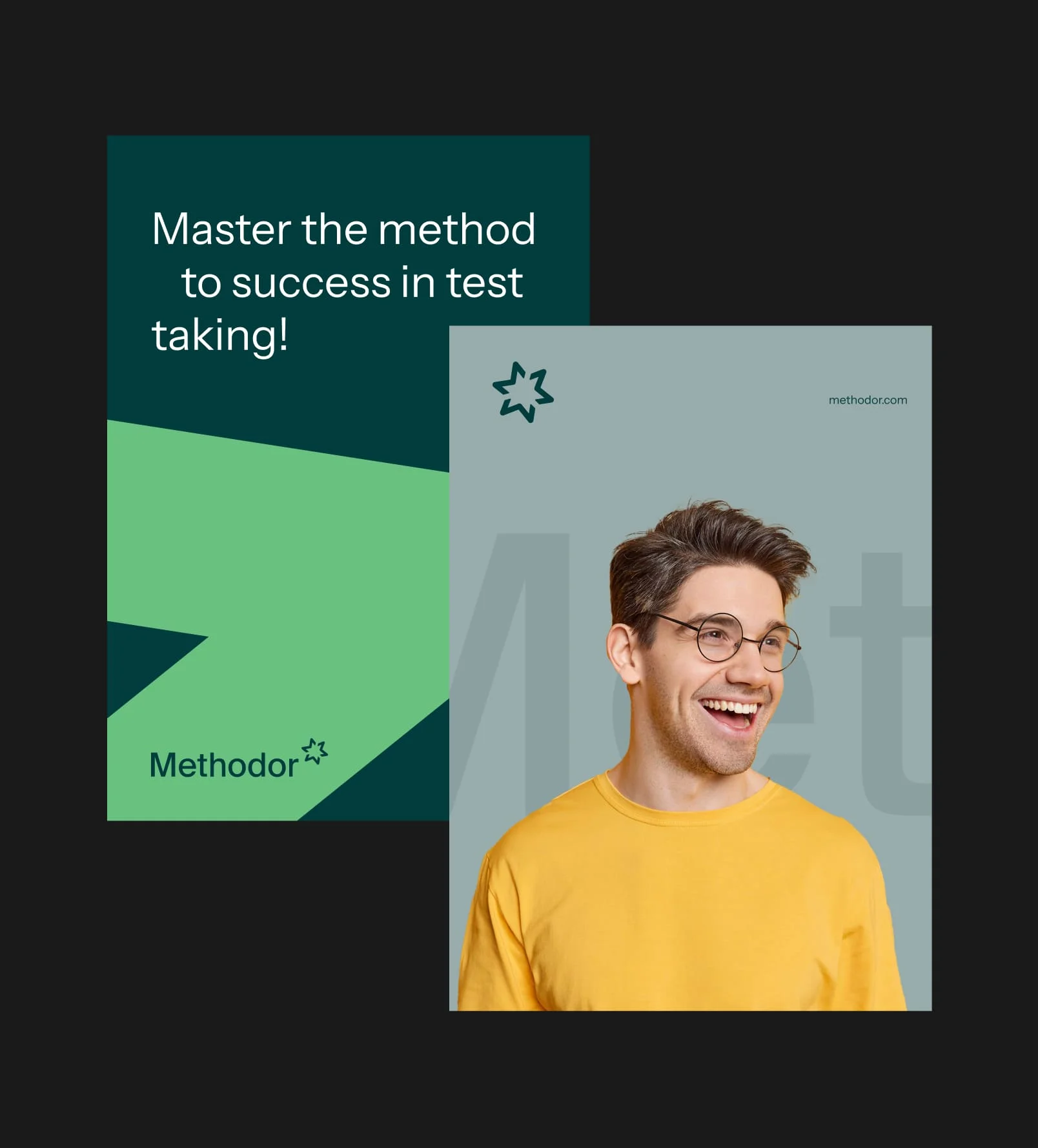
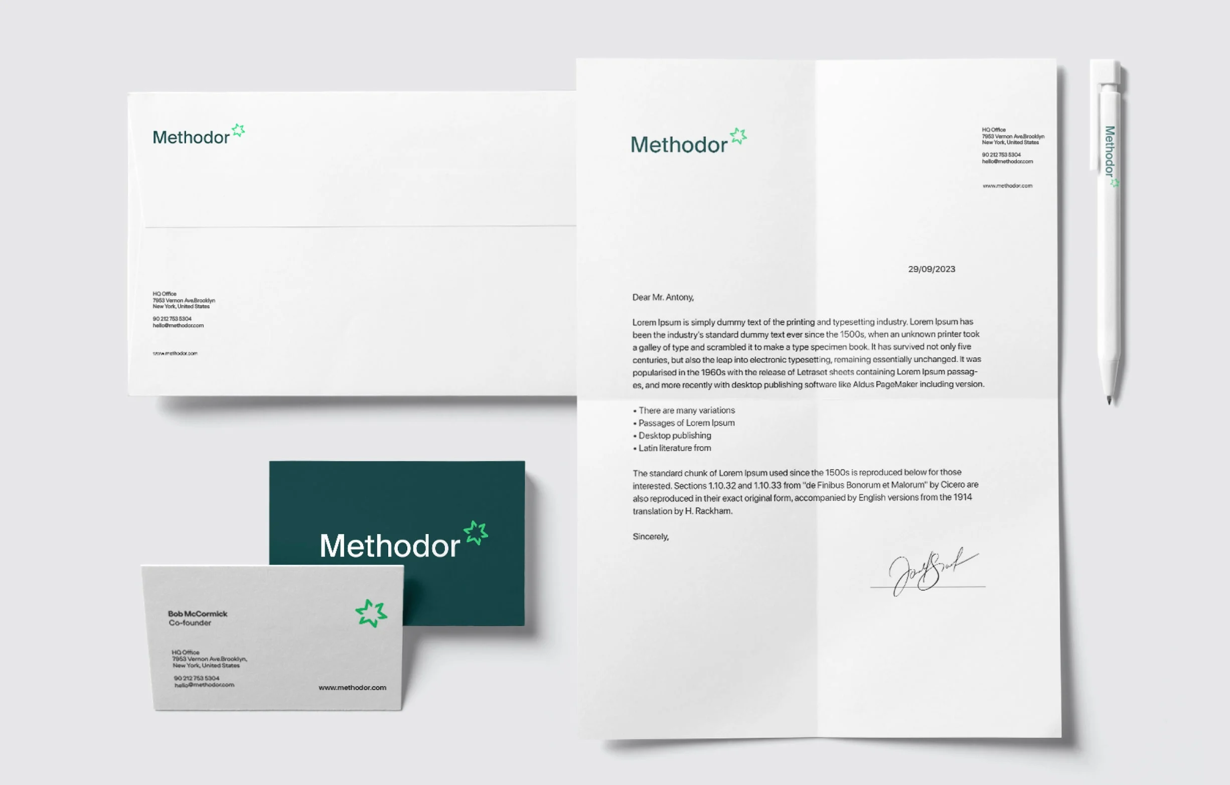
This cohesive identity flows effortlessly across all platforms, from the mobile app interface to marketing materials, ensuring a consistent and memorable brand experience for our audience.

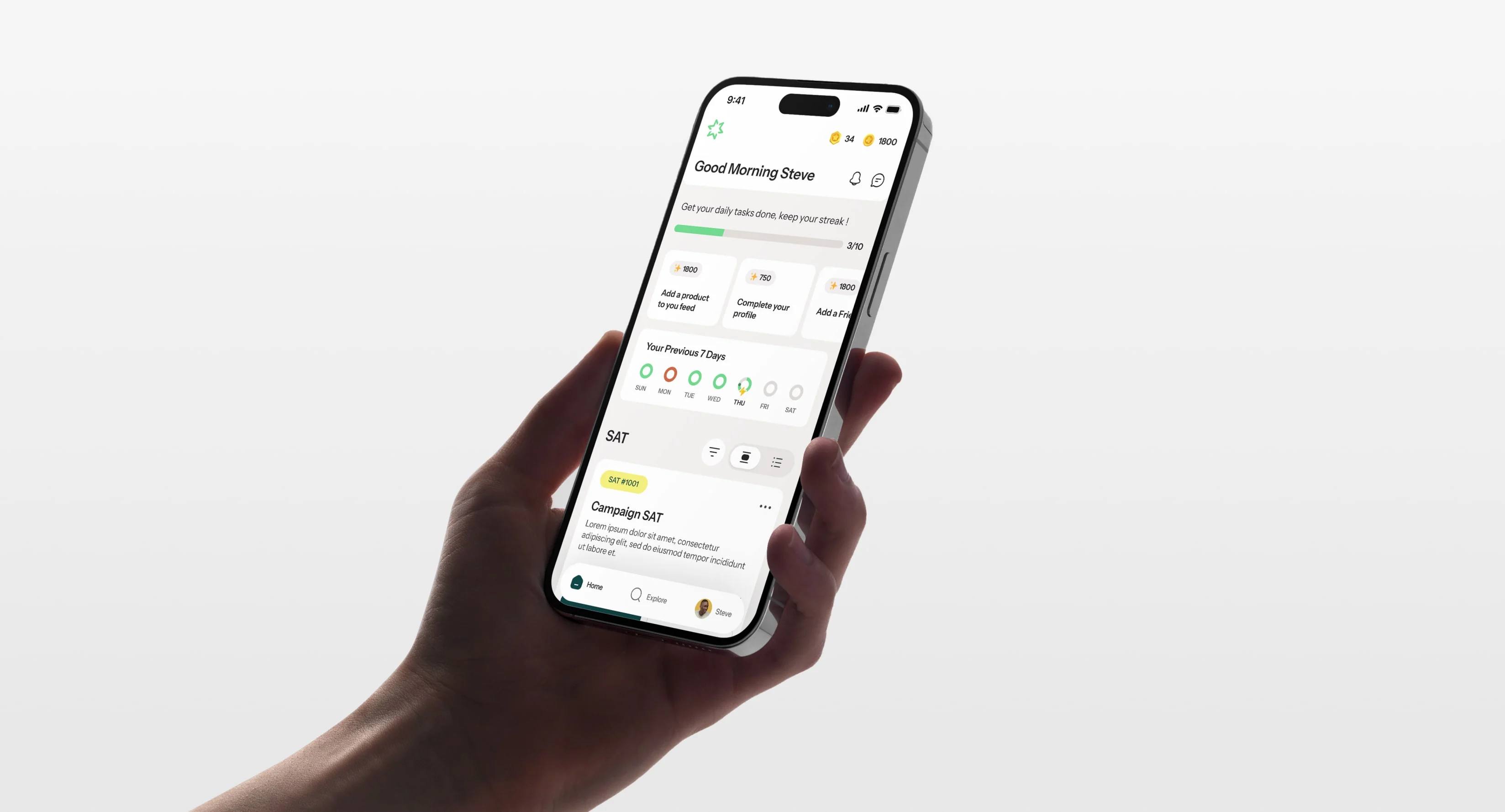
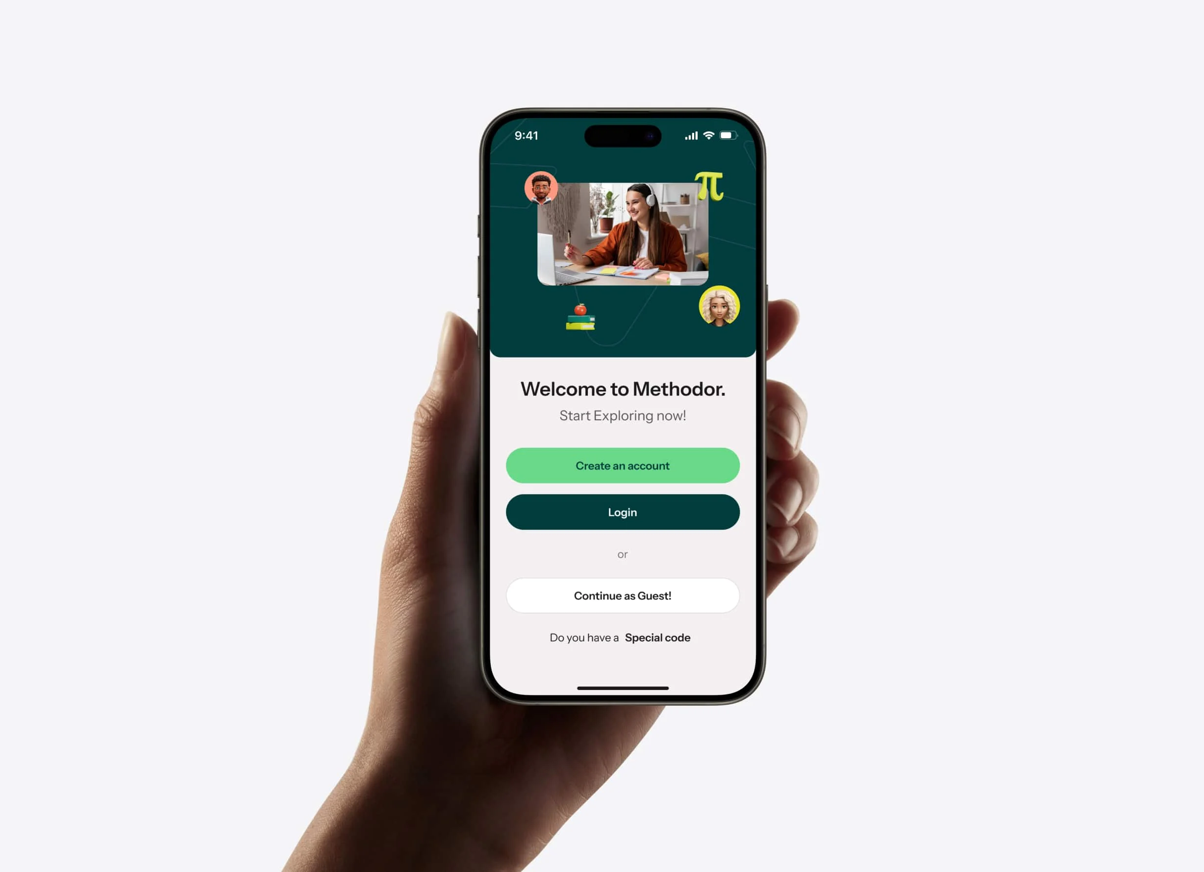
Methodor in Action: The Mobile App
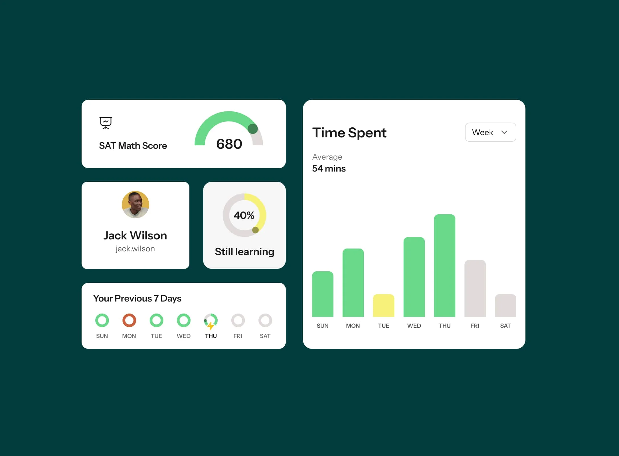
Our approach to designing the Methodor mobile app was informed by extensive research and our integral role in defining features aligned with its objectives. We conducted thorough investigations into user preferences and behaviors, leveraging our findings to shape the app's functionality and user interface. Our contribution was pivotal in ensuring that the app not only met but exceeded Methodor's goals, providing users with an intuitive and impactful learning experience.
Digital Execution
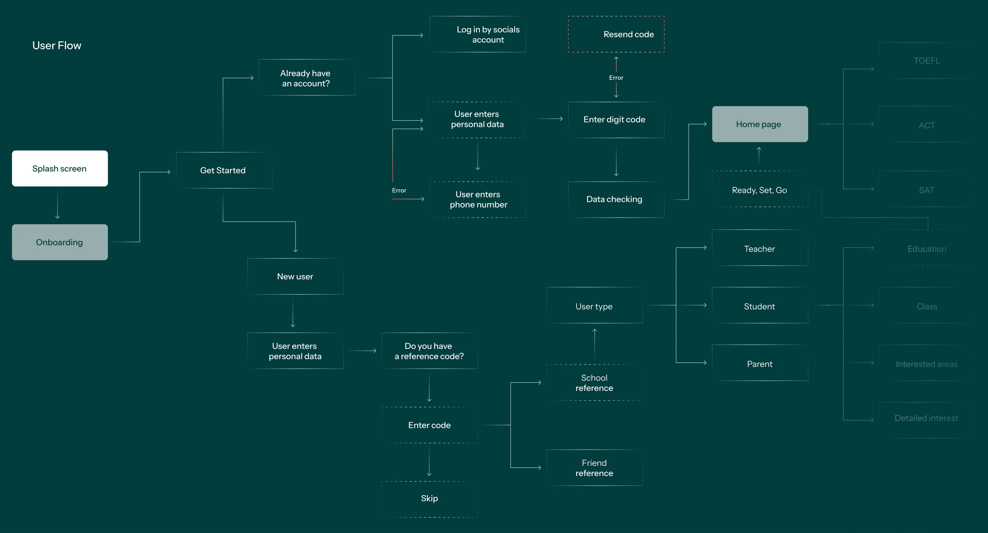
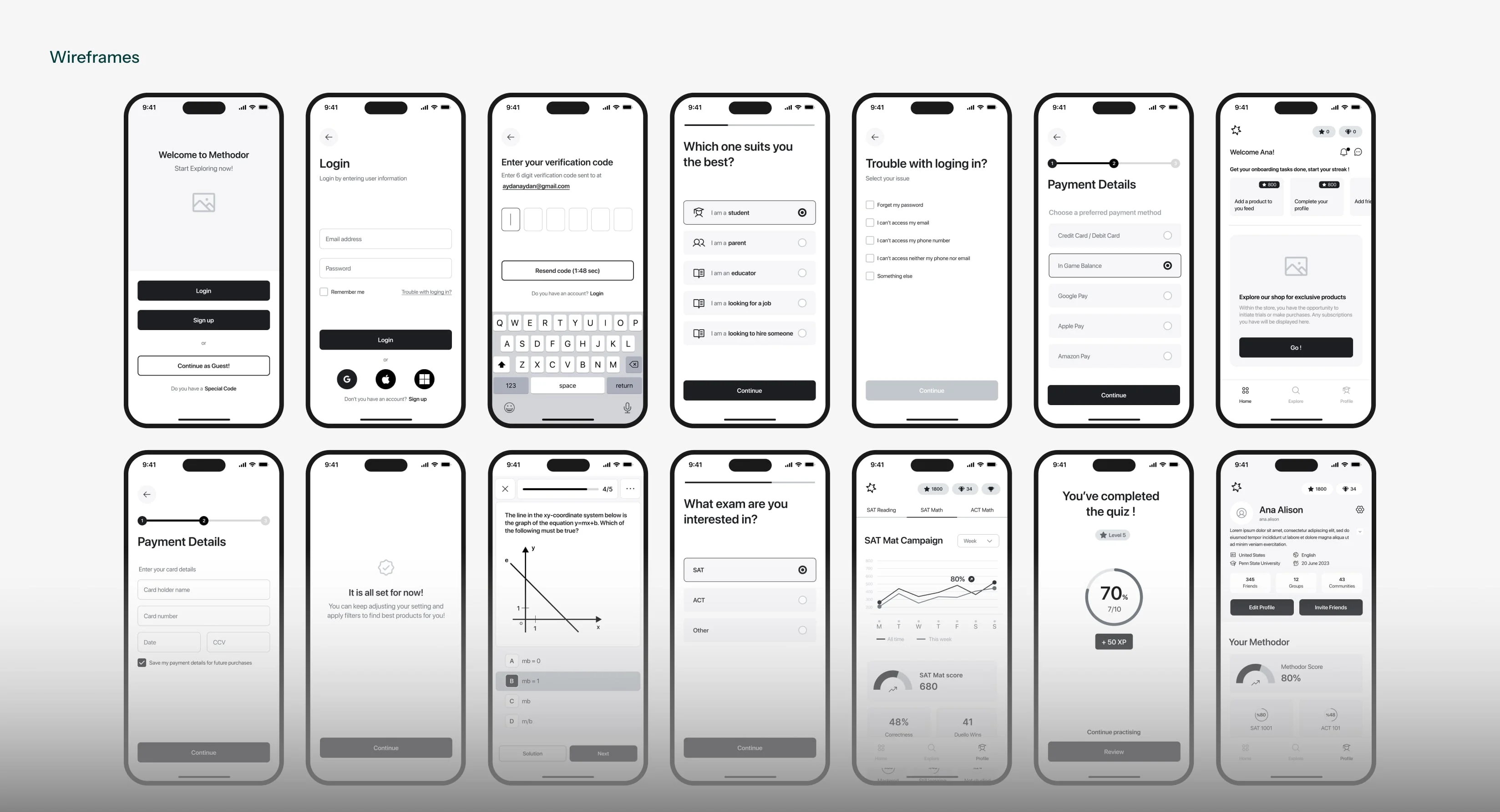
Throughout the design process, we prioritize user experience by mapping out detailed user flows. These flows inform the creation of wireframes and low-fidelity mockups that focus on layout and functionality. This allows us to iterate and refine the design, ensuring that every aspect works seamlessly.
• User Experience
• Prototyping
• Usability Testing
• UI Design
• Design System
• Dev Docs
